2. Configure Features and Item Types
As a customer, you are encouraged to maximize your investment in the Transflo Mobile+ app and Transflo platform by selecting the features you want to include in your subscription. As a customer, reach out to your Transflo administrator to enable your choice of features and configure the necessary item types. All features and item types are listed in this knowledge base (KB).
The features you can configure for the mobile app are listed in the same order that they appear in the TRANSFLO Express Server Administrator tool. (To learn more, see 4. Transflo Express Server Administrator.)
As an administrator, you can configure the item types for your Transflo Mobile+ app users by customer or fleet. The options available in the Transflo Mobile+ app can be configured using the Editor mode of the TRANSFLO® Mobile+ Menu Administration Tool. If the Modern View or Drivers Choice check box was selected on the TFM+ tab in TFX Server Administrator, you can configure features using Layout mode.
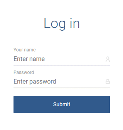
 Log In
Separate logins may be created with every customer account for various portals. The login credentials you were assigned may or may not be the same ones that you use to log in to Transflo Express Confirmation Viewer, Transflo Velocity Plus Command Center, and other portals.
Tip: With a Transflo One SaaS portal subscription and customer admin access to Mobile Menu Administration, you might also be able to customize your mobile app after logging in to to https://portal.transflo.com.
-
In a web browser, navigate to:
https://config.transfloflomobile.com
-
Enter the username and password that were assigned to you and click Submit.
-
The first time you submit this form, after a short delay, the Division page opens.
Select a Division or Fleet
The CHANGE DIVISION screen shows a list of all the brokers and fleets that your account has permission to access. The term division is synonymous with fleet. You see only the fleets and brokers that are configured for your account and for your current profile in the mobile app. If you have many fleets or brokers, you can filter the results shown on this page by entering part of the name in the Search Division field.
In the following example, the user entered SUPT to reduce the number of items to scroll through to find the fleet or broker the user wanted to find and edit.
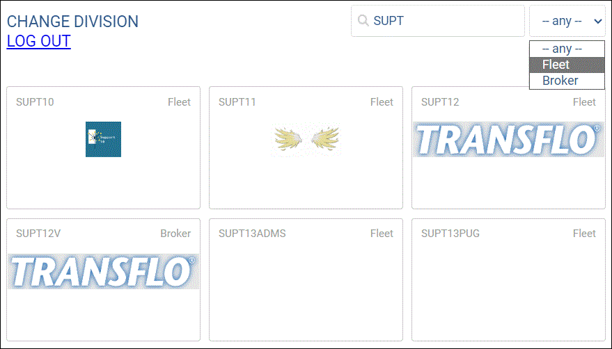
Clicking on a displayed fleet or broker opens the main configuration screen. The main screen has a Menu Navigator configuration panel on the left and an Editor section on the right.
You can also log out of the application from this screen.
Open the Main Screen
After you select a fleet or broker on the CHANGE DIVISION screen, the main screen appears.
Use the Menu Navigator on the left to set up the menu structure as it will appear in the mobile application. Use the Editor on the right to select item types, titles, thumbnails, URLs, and parameters.
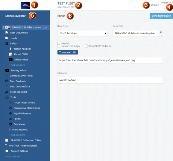
The top of the page also shows the following details:
-
If a logo has been supplied, it will be displayed here. If no logo has been uploaded, this area will show only a gray box.
-
The fleet name, fleet ID, and division type associated with your account. Currently, there are primarily Fleets and Brokers configured in the system.
-
The user name of the user who is currently logged in. Clicking on the arrow next to the user name provides options to change the division or log out. (The Back-ups selection is not currently used.)
-
The version of the Transflo Mobile Menu Administration application.
Configure Menu Items
In the left panel of the main screen, the menu configuration area shows a preview of what mobile app users will see on their mobile device. However, each sub-menu is collapsed on the mobile application even though it is shown fully expanded and not able to be collapsed in the Menu Navigator panel.
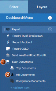
Two levels of menu items are available:
Top-level menu items are aligned along the left border (for example, Payroll, Report Truck Breakdown, Report Accident, etc.)
Sub-menu items are indented under the top-level menu items (for example, Trip Documents, HR Documents, and Compliance Documents).
Although multiple menu item levels can be created, it is advisable to limit sub-menus for ease of navigation on small portable devices such as cell phones.
Insert a new menu item:
-
In the Dashboard/Menu navigation panel, click the Add new item link.
-
In the Editor panel, select an item from the Item Type drop-down list box to insert in that location in the menu.
-
Enter the Item Title and any other information for this item.
-
When finished with this menu item, click the Save button to save the item in the Dashboard/Menu navigation panel.
-
To create levels, the higher-level items must be defined in the Editor panel as Menu item types. A Menu item type signifies that items inserted under it are sub-menu items.
Create sub-menu items under Menu items:
-
Ensure that the higher-level menu item is defined as a Menu item type.
-
In the Dashboard/Menu navigation panel, under the specified Menu item type, click the indented Add new item link.
-
In the Editor panel, select an item from the Item Type drop-down list box to insert under the Menu item type In the Dashboard/Menu navigation panel.
-
Enter the Item Title and any other information for this item.
-
When finished with this menu item, click the Save button to save the item in the Dashboard/Menu navigation panel.
Select an Icon
Any icons appear in the navigation panel in raw form and in their own color. All the icons are tinted with the theme of the application they are used in. (For example, the standard Transflo Mobile+ application icons are configured with the Transflo blue color.) However, for customer white-labeled applications, they are tinted to the specific color of that application.
Icons must meet the following three criteria:
-
128 pixels by 128 pixels maximum
-
monochrome (single color)
-
transparent
Otherwise, the icon will be displayed as a block of a single color.
To use a multicolor icon, check the Do Not Tint Logo check box when you configure the menu item in the editing panel.
You can use drag-and-drop by hovering over the three vertical dots on the left of an item and dragging the item to the desired location in the main menu.
-
If you drag-and-drop the top-level item that has sub-menus, the whole section is moved.
-
If you delete a top-level menu that contains sub-menus, all the sub-menus are deleted.
To insert a space in the mobile application menu to separate items, check the Header check box in the Editor panel.
Any changes made to the menu or configuration of items can take up to an hour to be reflected on mobile applications, because all the nodes in the cloud need to receive the updates, before they are available to the mobile application.
Configure Items on the Editor Page
The Editor panel in the right portion of the screen allows you to configure the Item Type that appears in the navigation menu configuration panel.
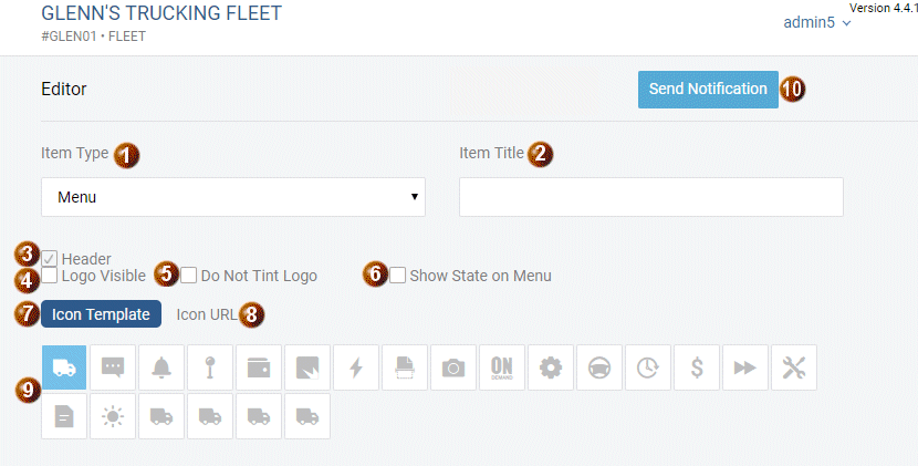
Item Type: The Item Type drop-down list box allows you to select the item to be inserted into the menu in the Menu Navigation panel.
Item Title: The Item Title text entry field is used to provide a name for this menu item.
Header: Selecting this check box provides a space above the menu item specified in the Item Type drop-down list box.
Logo Visible: Selecting this check box makes a logo visible in the mobile application.
Do Not Tint Logo: If you want to use a multicolor icon, you must check the Do Not Tint Logo check box when you configure the menu item. Icons must be a maximum of 128 pixels by 128 pixels, monochrome (single color), and have transparency.
Otherwise, the icon will be displayed as a block of a single color.
Show State on Menu: For menu items pertaining to features that have states (for example, Read or Unread, or delivery states such as Picked Up, In Transit, or Delivered), select this check box to enable the indicators in the mobile application.
Icon Template: The Icon Template is used to associate these small graphics with items configured in the Navigation Panel menu. You can choose one the standard pre-configured icons or you can also request custom icons to be included in the Icon Template section.
Icon URL: The Icon URL text entry field is used to specify a link to a custom icon. You can also provide the URL of an icon that you want to use. Icons must be a maximum of 128 pixels by 128 pixels, monochrome (single color), be in PNG format, be transparent, and be readily accessible from the Internet.
Icon Gallery: The default icons displayed in the Icon Template can be used as visual cues for the menu items in the Menu Navigator panel. The icons in the Icon Template are the default images. TRANSFLO® has uploaded useful icons to the cloud which are available for use and are optimized for the menu administration application.
Send Notification: The Send Notifications button allows you to send global fleet-wide notifications using either HTML or standard text to all mobile devices in your division.
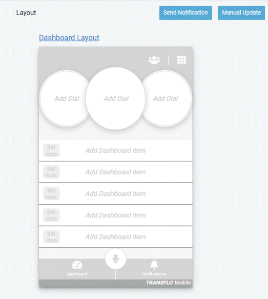
Design Your Own Mobile App Layout
If either Modern View or Drivers Choice has been selected on the TFM+ tab in the TFX Server Administrator, you can configure a dashboard interface for the mobile devices in your fleet.
-
Click the Layout tab at the top of the Menu/Dashboard navigation panel on the left side of the page. The first time this option is used, a blank Dashboard Layout is displayed in the right panel.
-
On the Layout tab, configure the Modern View interface for mobile devices used by drivers. You can configure and control the mobile functions available in the mobile app.
-
The drag-and-drop interface allows you to drag items for the navigation panel and drop them on the Layout panel to create a dashboard:

-
All changes to the dashboard are automatically saved and retained.
-
Items can be removed by hovering over the selection and clicking the ‘X’ that appears. When an item is removed, the rest of the menu moves up to fill in the blank space.
-
To cancel changes that you have made, click the Cancel button.
-
The default Dashboard (home) screen is comprised of the following sections (from the top of the screen to the bottom):
Header Bar: This portion at the top of the screen displays the following elements:
-
A company logo on the left side of the header. If a logo is not provided, then the Transflo Mobile logo is displayed.
-
A driver profile icon. Tapping the driver profile icon opens the Settings menu.
-
A grid icon. Tapping the grid icon opens the Main Menu screen.
Dial Controls: The three dials below the Header Bar represent a quick view of the most important items to the Driver in their work day. The dials can be tapped to navigate to the appropriate view for the action. To minimize the dial controls, swipe up and to restore, swipe down. When in landscape mode, the dials appear on the left side; when in portrait mode, the dials appear on the top.
Tile Controls: The tiles on the Dashboard display information/data on the drivers' most typical/important daily tasks. A maximum of 8 tiles can be displayed on the Dashboard and each can be configured with a title, icon, descriptive text, action badge (counter for notifications, loads, settlements, etc.), and an on/off indicator for Drivewyze. If you add more than 8 items to the tiles, the additional items are accessible from the Main Menu screen.
Bottom Bar: This portion at the top of the screen allows quick navigation between functions of the mobile app back to the dashboard. It also provides access to the microphone feature for voice control. This Bottom Bar is comprised of the following elements:
-
Dashboard link (Locked in)
-
Microphone for speech control feature
-
Notifications
-
Fleet ID (left side)
-
Transflo Mobile logo (right side)
-
-
On the Dashboard of the mobile app:
-
The controls have a tap action that will navigate to the appropriate view for the action.
-
The dial controls can be minimized with a swipe up and then can be restored with a swipe down.
-
When in landscape mode, the dials appear on the left side; when in portrait mode, the dials appear on the top.
-
Some menu items that appear in the dial view will appear as an Icon and Text or Title only. There will be no additional information displayed in the dial view for these menu items.
-
-
Any functions unable to be displayed on the Dashboard screen of the mobile app can be accessed on the Main Menu that is displayed by tapping the grid icon in the Header Bar.
Dashboard Dials
The three dials at the top of the dashboard represent a quick view of the most important items to the driver in their work day. On the mobile app, these dials can be swiped up to minimize them into three compact sections at the top of the dashboard. The dials can be restored by swiping down.
The following menu items are displayed in the dials on the dashboard of the mobile app with an icon and title only:
-
Accidents
-
ALK (border color changes to show state of functionality; if ALK is ON, the border is green)
-
AppLink
-
OS&D
-
Fuel Network
-
Find Transflo Express
-
Link
-
Load Scan
-
Menu
-
Message Form
-
Photoscan
-
Scan Documents
-
Settings
-
Transflo On Demand
-
Drivewyze (border color changes to show state of functionality. If Drivewyze is on, the border is green).
-
Loves Connect
-
MyPilot SDK (when selected from the dial view, it will open the app (in the case of app ink), the page, or the SDK).
-
Videos
Other menu items may contain links to various internal and external resources. Some examples of these are Weather, Loads, ELD, Settlements, and Chat.
Dashboard Tiles
Although dashboard tiles share similar functionality and elements with dials, the five (5) tiles under the dials are designed to show more information about the most typical daily driver tasks. Each tile is configured with the following items:
-
Title
-
Icon
-
Descriptive Text (2 max lines of text)
-
Action
-
Badge (counter) (chat, notifications, loads, settlements)
-
On/Off indicator for Drivewyze
Descriptive text on the tiles is displayed as follows:
-
Loads: number in transit, number accepted, and then number available
-
Drivewyze: displays logged in vehicle if available (if the vehicle is not available, the text will be blank)
-
Scanning: displays Scan New Documents
-
Videos: displays Watch training videos or Safety videos
-
Notifications: displays the number of unread notifications
When a driver selects a tile, one of the following actions is triggered:
-
Navigate to another view or menu
-
Navigate to another app by link or SDK