Transflo DMS Workflow Studio Workbench
TRANSFLO® Workflow Studio is a powerful business process modeling tool. The Workbench is where you will model processes, create fields and design forms for your processes.
 Start Workflow Studio Workbench
To start TRANSFLO® Workflow Studio:
-
From the Windows Start menu, select All Programs > TRANSFLO® > Workflow Studio.
-
The Workspace initializes and the Welcome window appears with links to web resources, samples, and tutorials to assist you in getting started with Workflow Studio.

-
Click on the Workbench link. The Workflow Workbench opens.

-
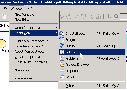
If the palette is closed, in the main menu, choose Window , Show View, Palette.

-
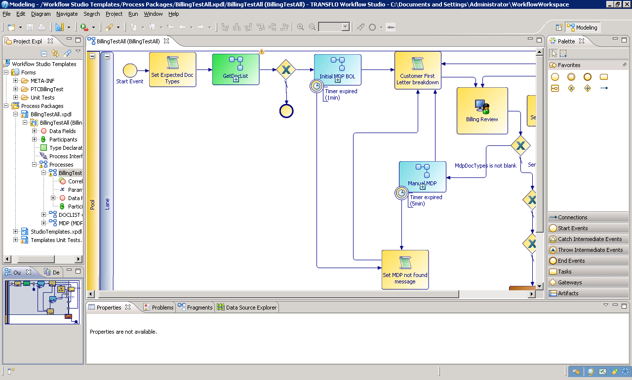
Workbench has toolbars, a Project Explorer, an Outline View, a Main Editor, a palette and a Properties View.
 Project Explorer
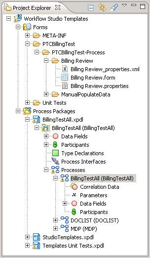
The Project Explorer on the left side of the Workbench is where you organize your work in Projects.
-
Projects are groups of files on your hard drive that are saved in what is called the Workflow Workspace.
-
Project Explorer is the Workbench tool for creating and maintaining these files.

-
In the Project Explorer you can create or re-use Process Packages. Process Packages define Data Fields, Participants, Processes and Scripts.
-
The forms that your processes will use are also created in the Project Explorer.
-
The Project Explorer is where you import Process and Form templates and where you deploy completed Processes.
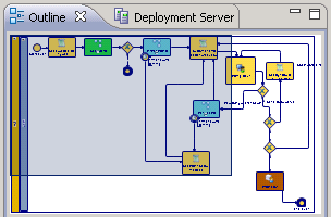
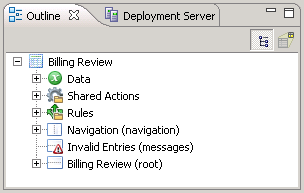
 Outline View
The Outline View below the Project Explorer gives you a summary of what is in the Main Editor. If you are editing a Process in the Main Editor, the Outline View is similar to the diagram below. It shows the entire Process and highlights what is visible in the Main Editor.
You can change what is visible in the Main Editor, by dragging the highlighted area in the Outline View to show the desired area.
If you are editing a Form in the Main Editor, the Outline View contains a summary of the elements of the Form. These include the Data Model that has the data elements that are accessible by the Form, a listing of all of the Panes on the form, and the items that are in each Pane.
Main Editor
The Main Editor is where you model your Processes and where you design your forms.
-
If you are creating or editing a Process, the Process Editor opens in the Main Editor.
-
If you are creating or modifying a Form the Form Editor opens in the Main Editor.
-
Other objects, such as scripts, can also be edited in the Main Editor. For a list of iProcess System Values that can be used in your Workflow Studio scripts see .
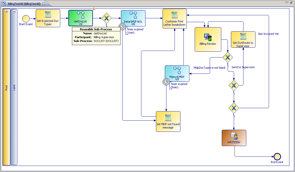
Process Editor
The Process Editor gives you a visual representation of your Process.
You build your Process by adding steps, conditions, timers, etc. to your Process and them connecting them with flow arrows.
The result looks much like a traditional flow chart.
You can organize your Process into swim lanes giving it more of an activity diagram feel.
Form Editor
In the Form Editor you create Forms tied to manual steps in your Processes.
You can organize your Forms into Frames where you place labels, buttons, text boxes and messages.
The GI Preview tab at the bottom of the Form Editor lets you preview how your form will look like once it is deployed.
Palette
The Palette is located to the right of the Main Editor and is visible when you open a Process or a Form.
The Palette contains objects that you can drop on your Form or your Process.
The Palette is different depending on whether you are editing a Process or a Form in the Main Editor.
Process Palette
The Process Palette has tools that you select and drop into your Process.
This Palette has Start and Stop Events, Tasks that are used represent steps in your Process, Sequence Flow arrows to connect your steps, and Gateways to make decisions or to split Processes.
You can also add Text Annotations to make your Process easier to understand.
You can organize your tasks by grouping them with Group, Pool and Lane objects.
You can also create Sub-Process that are executed from the main Process and can be reused by other Processes.
In order to handle errors, the Process Palette also includes Throw and Catch Intermediate Events.
The tasks that you use the most frequently are displayed under Favorites at the top of the Palette.
The different types of Tasks are expanded in the diagram to the right.
These include Tasks performed by a person and other tasks that are automated.
Human tasks create Queues for users and are tied to Forms.
To see descriptions of the Process Elements, hover your mouse pointer over the corresponding icon in the Palette.
Form Palette
The Form Palette is visible when you create or edit a Form and is used to drop Form Controls such as Text Boxes, Check Boxes, Radio Buttons, Date Pickers, Option Lists, Hyperlinks, etc. on your Forms.
Form Controls can be grouped into Containers such as Vertical, Horizontal, and Tabbed Panes.
There is also a special type of Container called a Message Pane where error messages can be displayed.
The Message Pane Container is hidden to the user unless there is a message to display, such as a validation error.
Although you can create custom buttons with the Button control, there are four pre-packaged buttons that do not require scripting for them to function.
These are the Submit, Apply, Cancel and Close buttons.
The Submit button saves the changes the user made, moves the Case to the next step of the Process and closes the Form.
The Apply button saves the changes the user made but keeps the Form open.
The Cancel button discards the User’s changes, closes the Form and the Case will remain in the User’s Queue.
The Close button saves the User’s changes, closes the Form and the Case remains in the User’s Queue.
To see descriptions of the Form Elements, hover your mouse pointer over the corresponding icon in the Palette.
Properties View
Below the Main Editor is the Properties View which is a very powerful part of the TRANSFLO® Workflow Workbench.
The Properties View is where you can view and modify the details of practically every item that can be created or selected in the TRANSFLO® Workflow Studio.
If you select an item in the Project Explorer, its properties are displayed in the Properties View.
Whether you select a step in a Process or a control in a Form, all of the attributes of your selection are displayed and can be edited in the Properties View.
Along the top of the Properties View is a series of tabs.
The most commonly used tabs are the Properties tab and the Problems tab.
The Properties tab has a row of menu buttons on the left.
Clicking on each menu button displays a set of attributes for the item you selected in the Workbench.
The Problems tab shows a list of Problems, Warnings and Infos about your Project.
If you project has Problems you will not be able to deploy your project.
The Problems tab will assist you to locate and fix problems with your project.
Warnings are less severe but should be addressed if possible.
Infos are non-critical issues that can be investigated but will not affect your project.
Toolbar
The Toolbar has icons for the most common functions used in the Workbench. They correspond to functionality available in the Workbench menus.
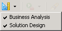
The first toolbar item that you will use is the Perspectives icon.
If you only select the Business Analysis perspective you will be able to design basic Processes and forms but you will not be able to deploy your Process, add functionality to your Process or edit the Templates.
These features are available with the Solution Design perspective.
Select both the Business Analysis and the Solution Design perspectives.
On the right hand side of the tool bar are Zoom In and Zoom Out icons that are used to magnify areas in the Main Editor.
You can also set the zoom level as a percentage of the Main Editor’s content size with the adjacent drop-down.
To the left of the Zoom icons are a series of icons used to align items in the Process Editor.
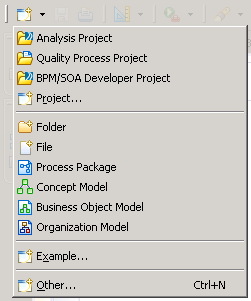
The New icon, located on the left side of the toolbar, is used to create new Projects, folders, files, Process Packages, etc. in the Project Explorer.
Clicking on this icon the New wizard.
To view the other options click on the down arrow immediately to the right of the New icon.
The following is a list of other commonly used Toolbar icons:
| Icon | Description |
|---|---|
|
|
Save the active Main Editor contents |
|
|
Print the active Main Editor contents |
|
|
Open the search dialog box |
|
|
Navigate backwards |
|
|
Navigate forward |

Expand and Restore the View Panes
Each view pane can be maximized to fill the entire Workbench work area. This is especially useful when you are editing a large Process. To do this, follow these steps:
-
Double-click the tab of the view pane you want to expand.
The view pane fills the work area.
-
To restore it back to its original size double-click on the tab again.
-
When a pane is maximized the other open panes are docked and collapsed. You can click on the corresponding icon and the docked pane will open without restoring the size of the maximized pane.

The table below describes the groups of icons shown in the image above.
Group Pane Description 
Restore
Restore the maximized pane.
Project Explorer
Show the project explorer

Restore
Restore the maximized pane.
Outline
Show the Outline View.
Deployment Server
Show the Deployment Server View where processes are deployed to the Workflow Server.

Show view as a fast view
Opens a menu where you can select and open views:


Restore
Restore the maximized pane.
Properties
Opens the Properties View.
Problems
Show the Problems View.
Fragments
Show the Fragments View.
Data Source Explorer
Show the Data Source Explorer.

Palette
Expand the Palette.
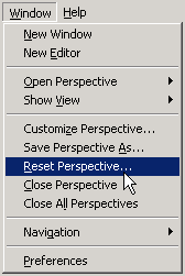
To restore all of the tabs to their default locations click Reset Perspective... from the Window menu.